Tigercub:
As Blue as Indigo
Tigercub’s second album, 2021: a comeback record built on colour theory, with an identity that made the idea visible and a rollout that treated scarcity and direct conversation as the marketing.
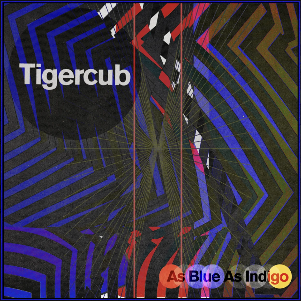
01 / Album cover, 2021
Concept
The album began with a question: how subjective is sadness? When I see blue, do you see the same colour?
The identity was built to hold that idea. Cover, packaging, website, banners and announcements all played with how colour is perceived, and on 15 January 2021 the site and socials turned indigo, the first public sign of the era.
Artwork journey
- Colour and paint. The cover is acrylic paint on white inside a Klein-blue frame, with Soulages, Joan Mitchell and Cy Twombly as references. The palette is Klein blue, red, olive and black. The blue echoes International Klein Blue, the ultramarine Yves Klein registered in 1960, and it anchored the frame and the whole campaign: one colour carrying the emotion.
- Optical breadcrumbs and curb appeal. Small optical illusions run through the artwork, for the concept and for curb appeal: a record has seconds to read from a shelf or a thumbnail on a streaming service.
- Typography. Akzidenz Grotesk at a tight −60 tracking. The band’s logo was simplified so the artwork could lead.
- One system across formats. Trans-blue vinyl, solid white for independent stores, and a hand-numbered edition of 500 in three-colour vinyl with the band’s first flexi disc.
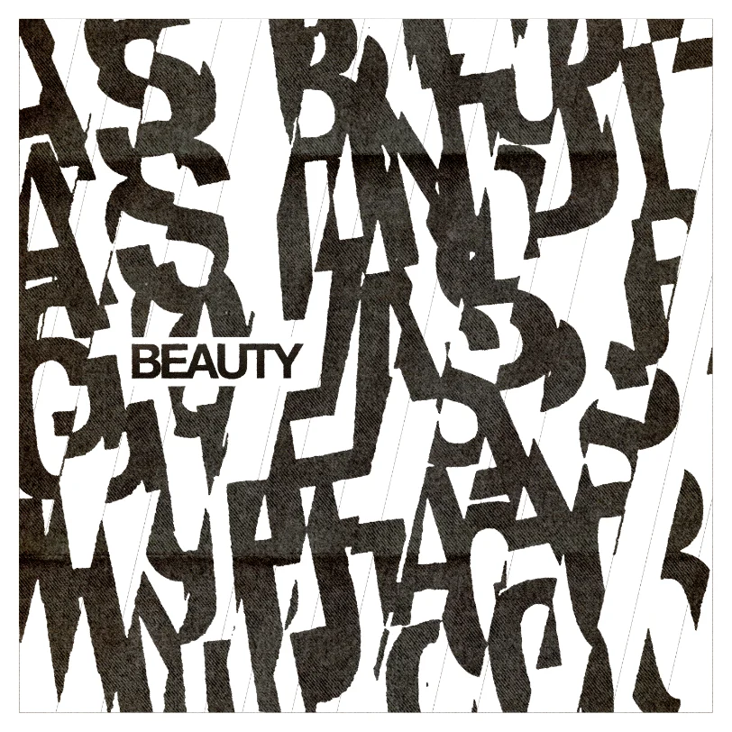
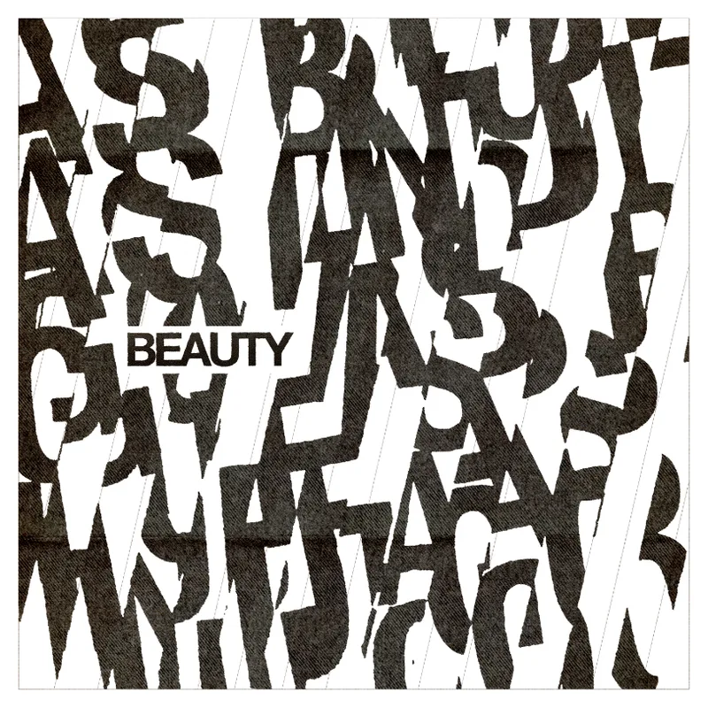
Logo and logomarks
The options explored the psychology of perception through shape, to support the idea that seeing is subjective. The Hering illusion felt strongest: straight lines that appear to bow over a field of radiating lines.
Strategy
The band had talent, endurance and a loyal core following. The aim was to deepen that connection through direct conversation while social reach was falling: social first, then email, then physical mail sent straight to fans.
It was first tested on the 2017 EP Evolve Or Die. For the album: unexpected letters in January and February 2021, which fans photographed and shared, growing a cult following on social; a first-come list of 300 “true believers”; and a secret pre-order window, 22–25 February. Scarcity pushed fans onto the mailing list, an owned channel with direct email engagement instead of rented reach.
The groundwork was already there. In January 2020 the band’s secret show sold solely through the email list, geotargeted to Brighton, with click and purchase conversion rates of up to 80%.
Fan assets
Around 22 February the band released Beauty and Bass Drum with the bass, drums or guitar removed, as a Digital Deluxe Players Bundle. Fans used the raw tracks to make their own YouTube videos, which carried the album’s marketing further.
Rollout
The first target date was set 25 weeks out, in October 2020, and moved before settling on 18 June. Colour banners kept the idea moving between announcements.

Website design, January 2021 - 18 JanFirst fan letters
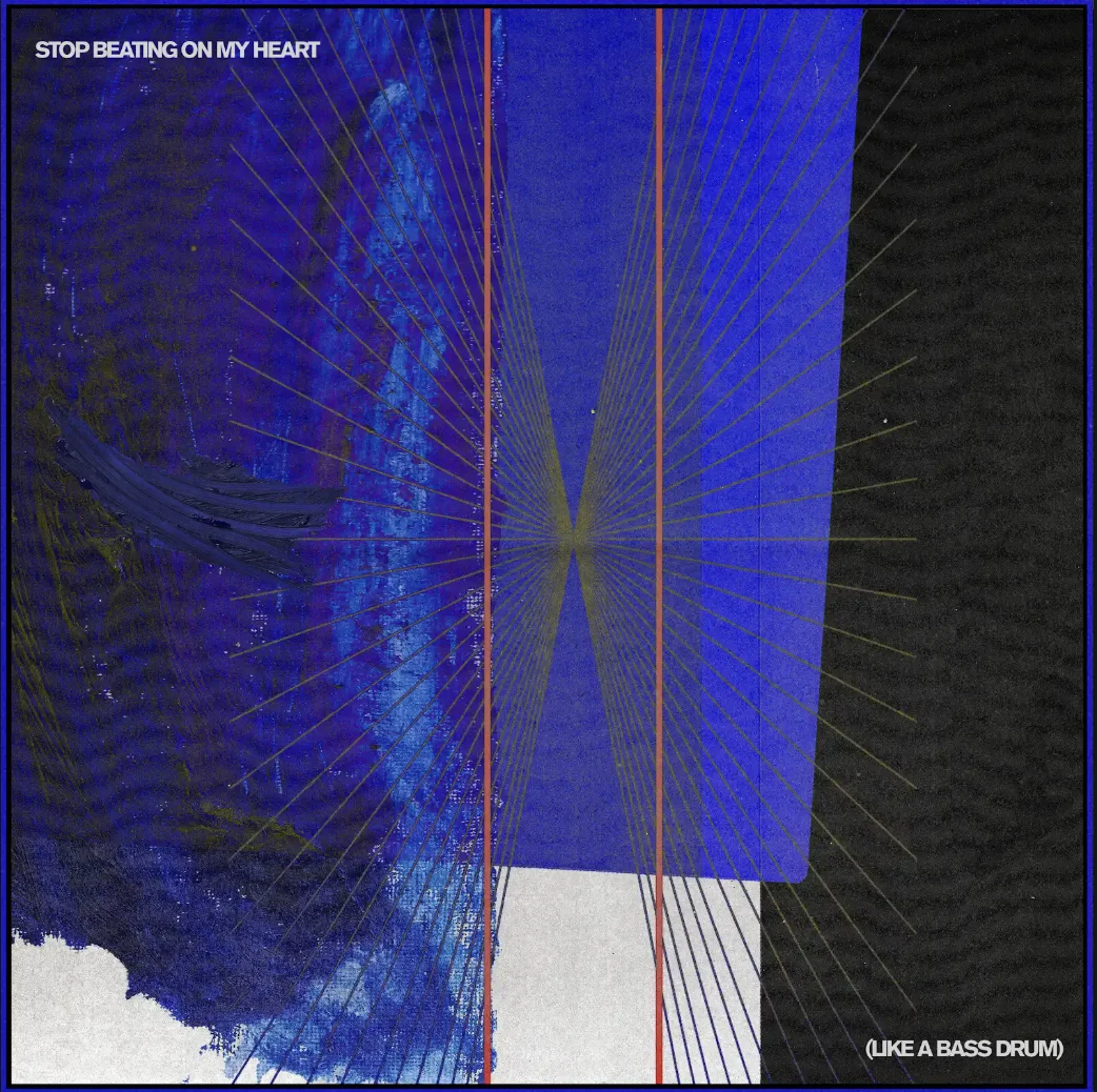
Single artwork - 19 FebLetters, round two

Newsletter to the list, 25 Feb 
Announcement newsletter 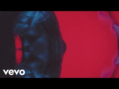
Watch on YouTube ↗ 
Watch on YouTube ↗ 
Watch on YouTube ↗ 
Watch on YouTube ↗ 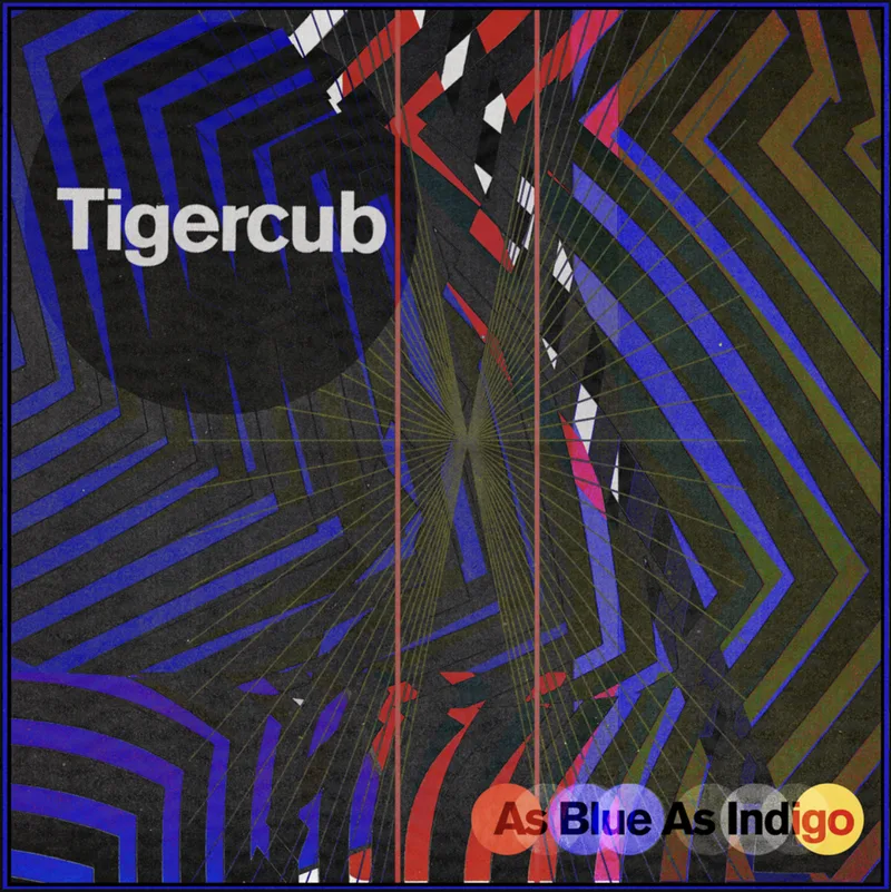
Album cover
Context
I managed Tigercub from the start of their career and released As Blue As Indigo through BLAME Recordings, the label I founded. Jamie Hall produced the record at Brighton Electric with Adrian Bushby.
Campaign
- Spotify editorial: “Beauty” added to Totally Alt
- US rock radio adds: KPNT and KXXR
- Amazon Music billboards in Leicester Square and Euston on release day
- “Overload” recorded as an Amazon Original
- UK touring with Royal Blood, 2021
Team
Management, creative direction and the label, run with Jamie Hall. The Orchard handled radio, press, digital and marketing. Mixed by Tom Dalgety, mastered by Robin Schmidt at 24-96, radio edits via Miloco.
Results
Four-star reviews from Kerrang, DIY, Dork and Upset, and 8/10 from Under The Radar.
Also #1 on UK Independent Album Breakers and #30 on UK Physical Albums.
Credits
Management, A&R, creative direction: Griffin McCabe
See full credits